The Brief
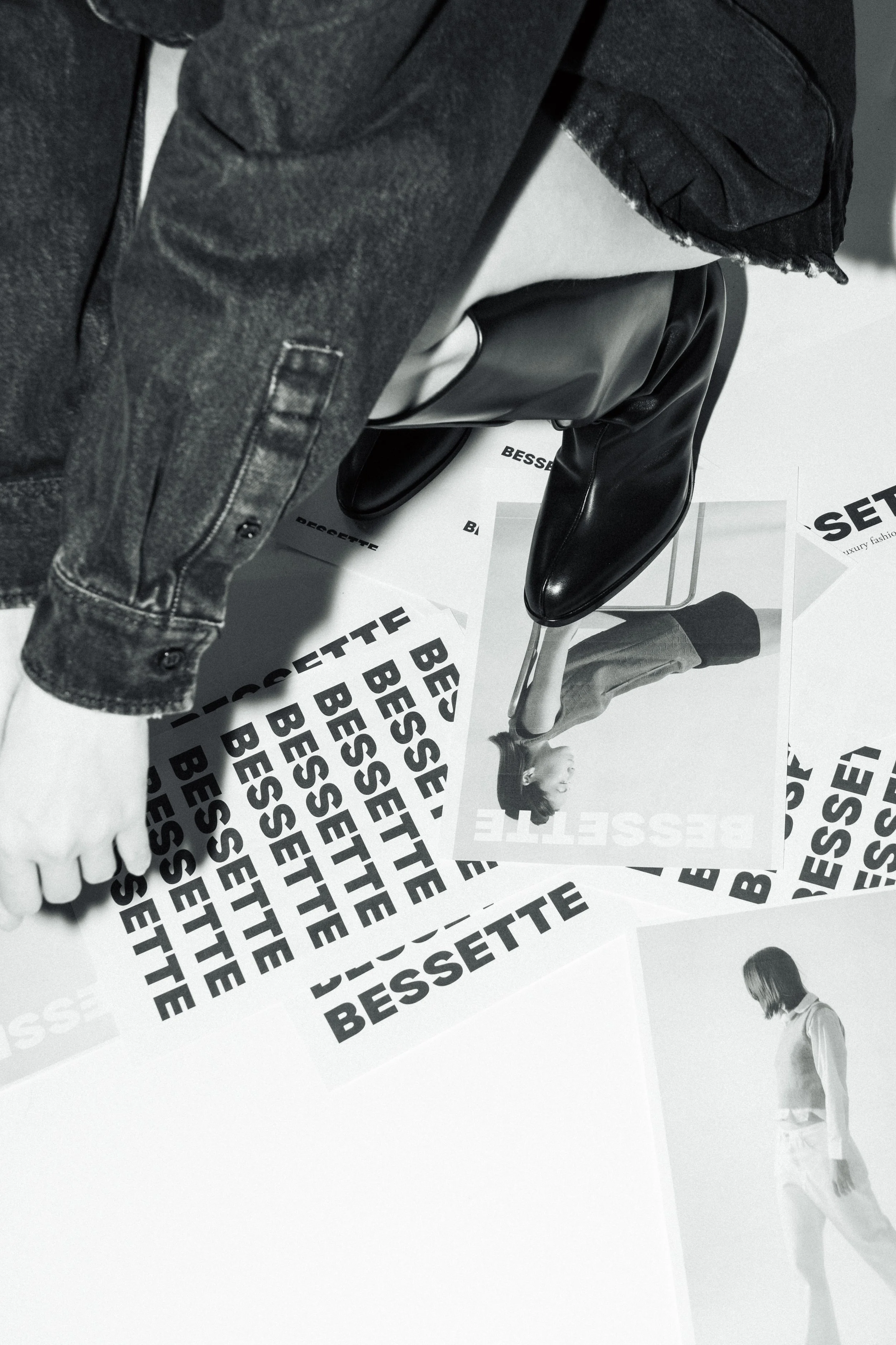
Bessette is a luxury resale platform, sourcing overstock and past-season pieces directly from brands and selling them at 30-70% off. I joined at the very beginning, when the goal was building brand awareness, a distinct identity, and sales through bi-monthly campaigns tied to each new drop.
The Services
Social Media Strategy | Brand Positioning | Art Direction
The Insight
Most resale platforms (SSENSE, Net-a-Porter, My Theresa) piggyback on the original brand's own marketing and imagery; they sell the discount, not an identity. Our customer was different: a high-earning professional with genuine taste who wanted the full luxury experience without the price tag or the compromise of a defective sample-sale piece. She wanted to shop responsibly without feeling like a lesser customer.
The Strategy
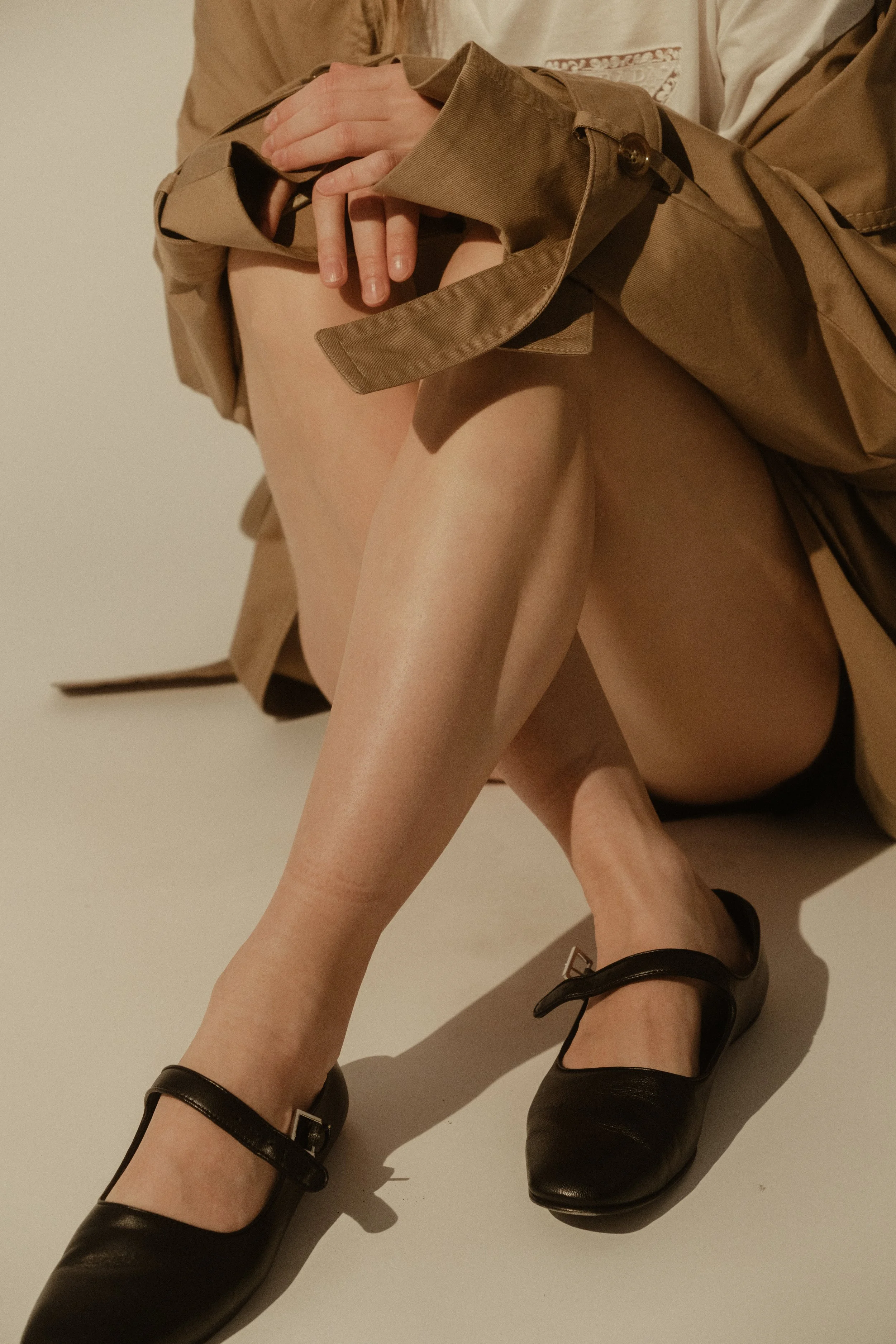
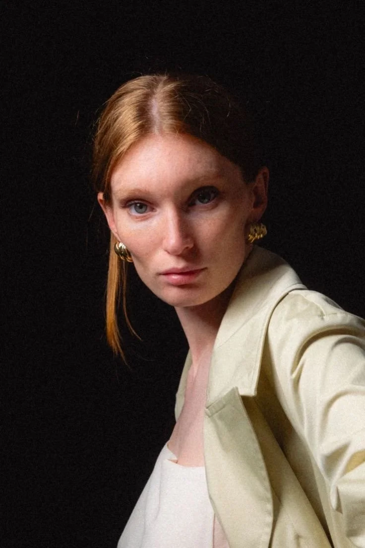
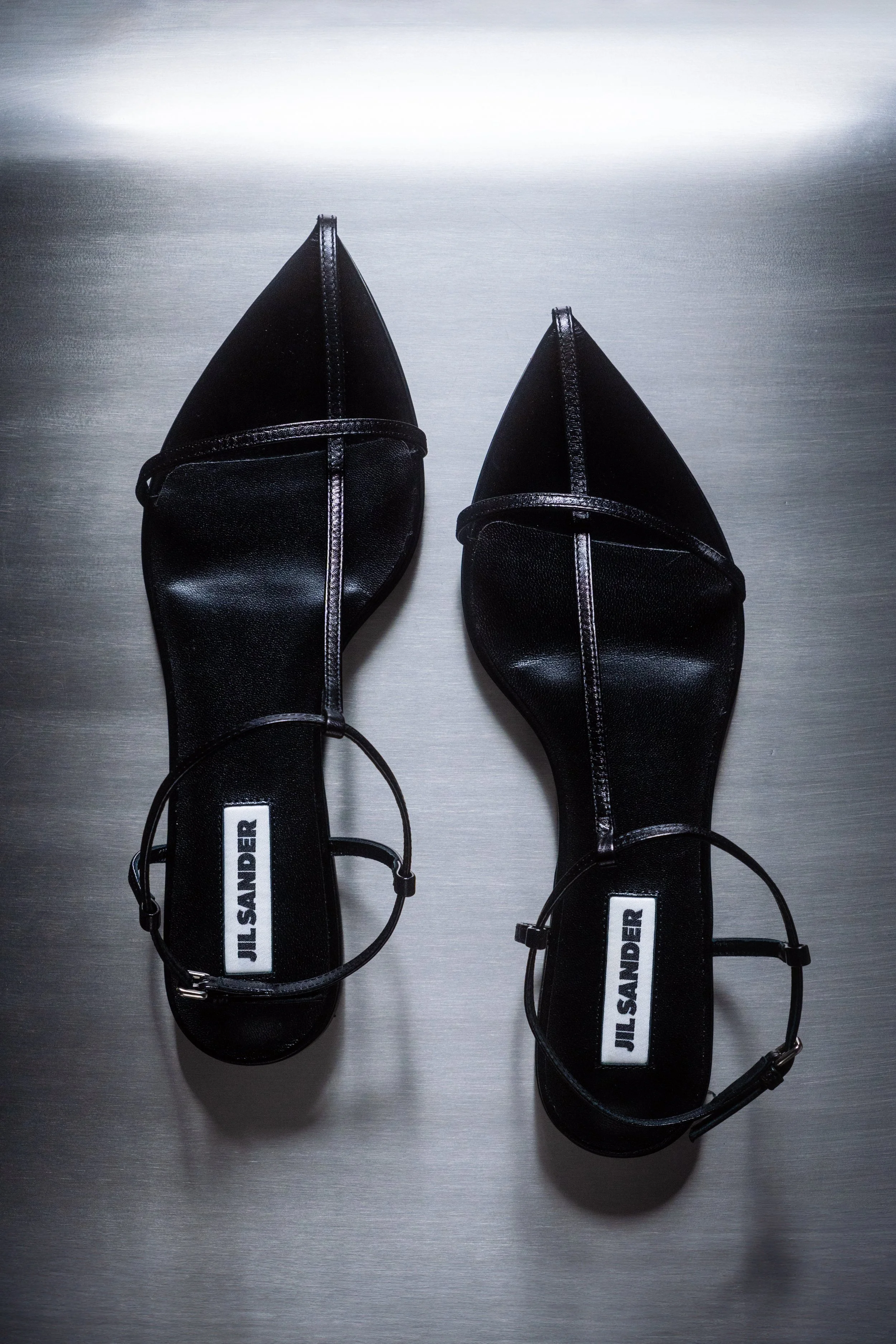
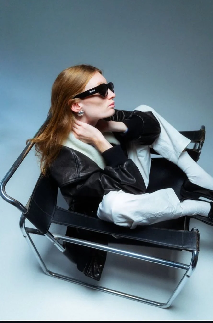
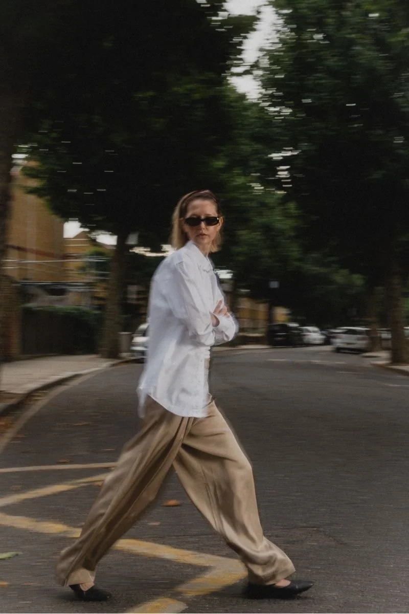
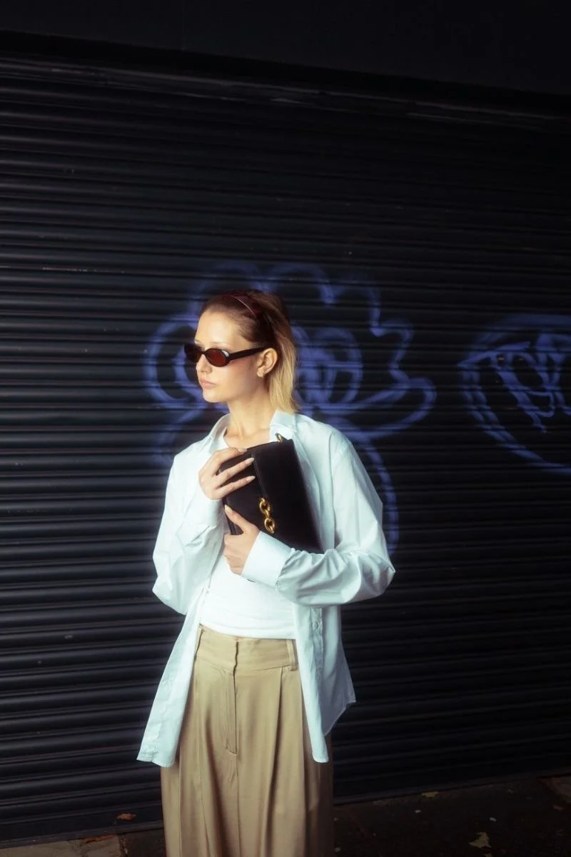
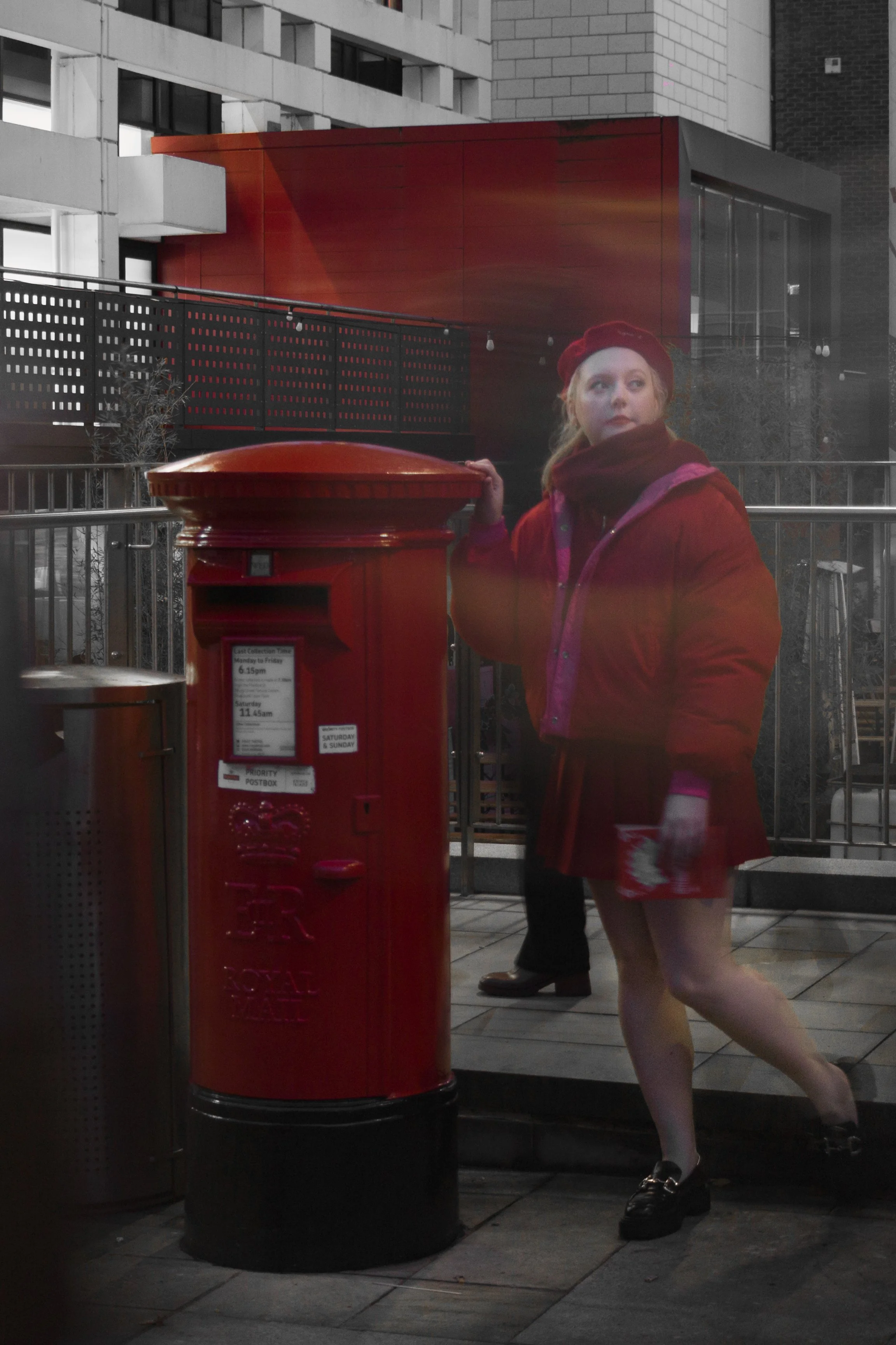
Rather than compete on discount, we built "the Bessette woman"; a look inspired by Carolyn Bessette-Kennedy: minimal, chic, with the occasional bold pop of colour. Every campaign was shot as high-quality editorial, seasonal, and set in the everyday spaces our audience actually moved through - the street, the station, the desk. So the resold pieces felt discovered and elevated, not simply discounted
My Role
As Junior Content Strategist, I worked closely with the founders across moodboarding, strategy and concepting, location scouting, and Shopify and social strategy. I led trend research and short-form content on TikTok, filming and editing myself, translating what was trending into a distinctly Bessette take, always in service of one goal: proving that shopping resale with Bessette didn't make you any less a luxury customer than shopping direct

The Outcome
Campaign work like this helped scale Instagram from 15K to 50K followers and establish Pinterest as a genuine discovery and traffic channel, while our editorial approach increased engagement by 35% and tightened production turnaround by 20%. The brand grew enough to open multiple pop-up stores and now ships worldwide.

Voyageur


The Services
Brand Strategy | Editorial Direction | Web Design
The Insight
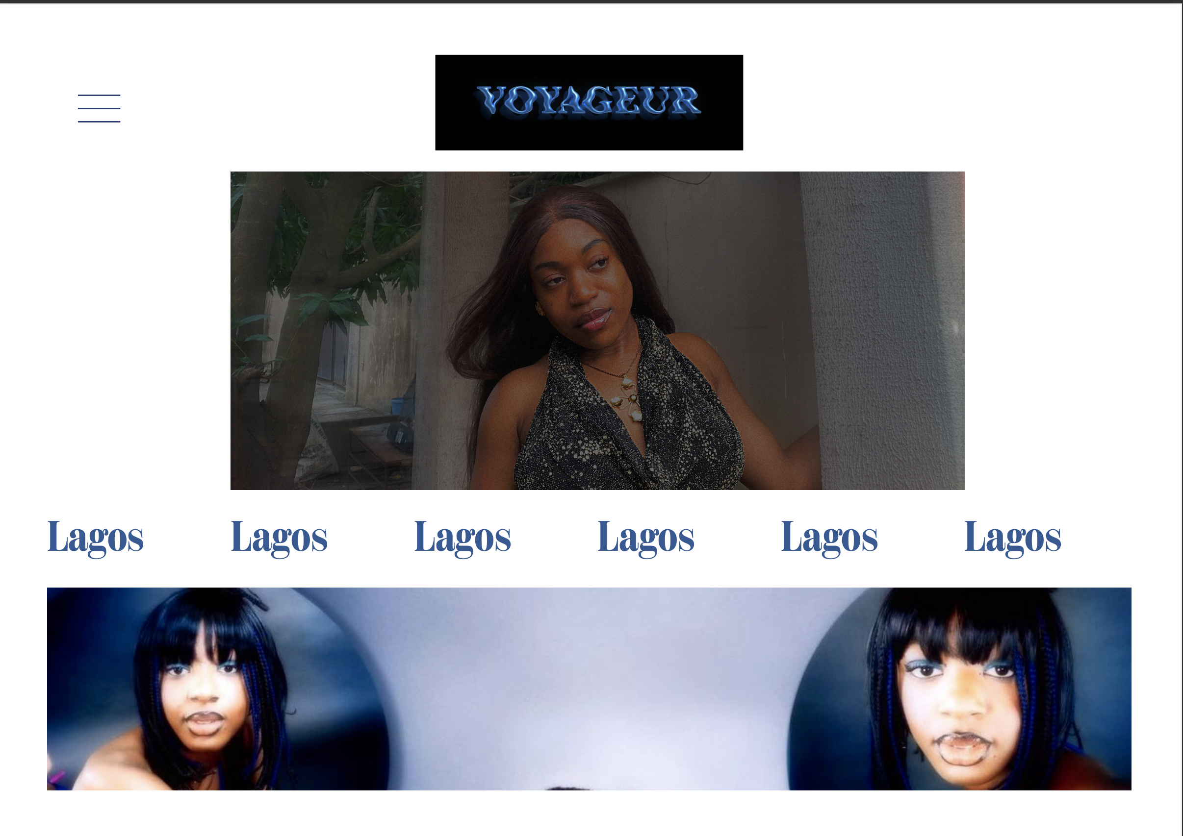
I’m Nigerian, living in London, watching Korean and Chinese dramas, learning French and Mandarin, with a genuinely multinational feed and friend group. Fashion media still treats identity as belonging to one place. My lived reality, like most people’s now, is glocal.
The Strategy
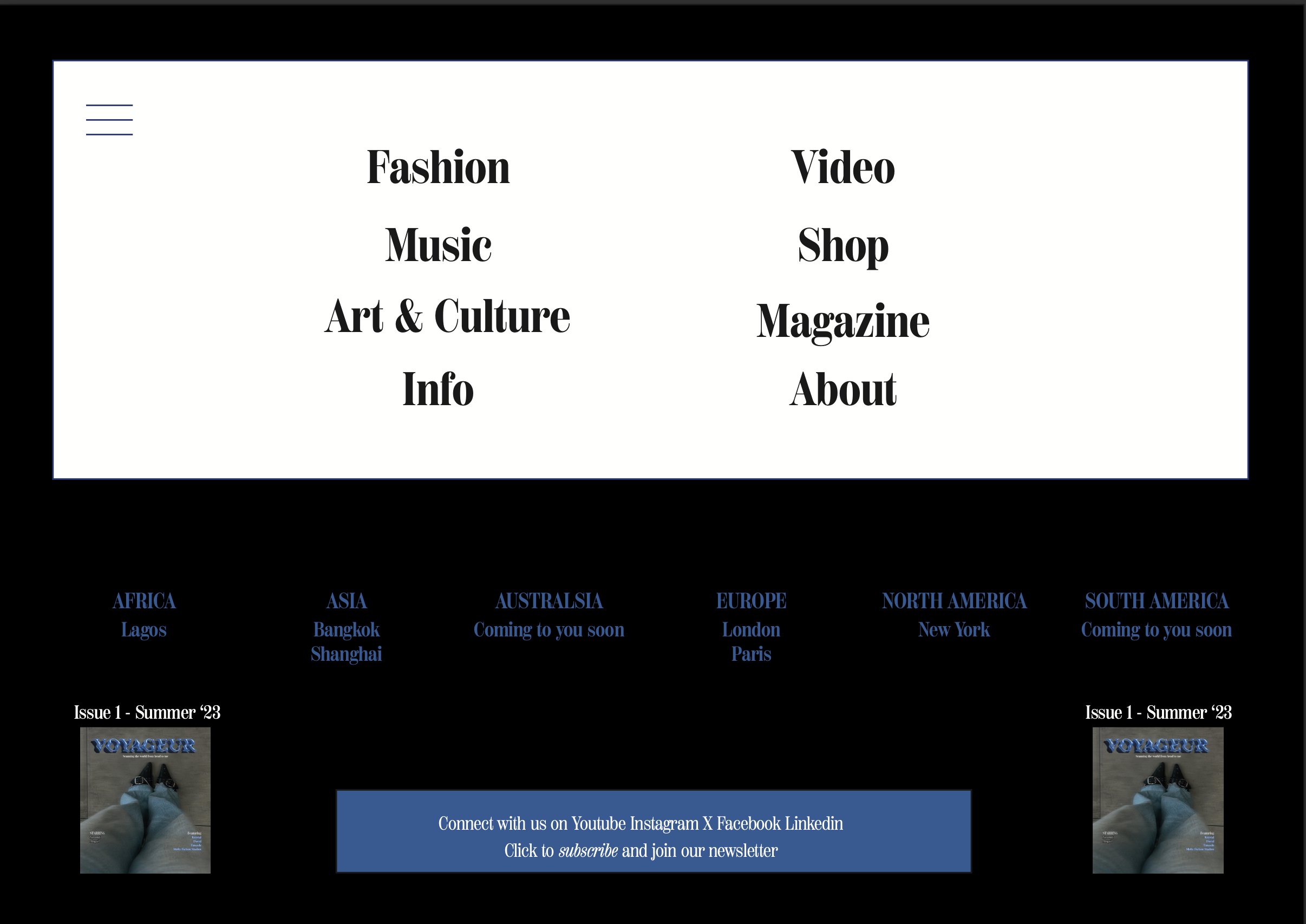
Voyageur:French for “traveller” - reports on fashion, art and music across global cities, tagline “Scanning the world from head to toe.” Built around my two homes, London and Lagos, each with its own chapter led by a local creative. We bring raw authentic stories from ordinary people of these cities by ordinary people in these cities. The logo moves like a wave; the palette echoes ocean light; the brand itself reflects movement.
My Role
Solo concept, editorial structure, and all magazine content: shot, written, edited and arranged by me plus website UX/mockup and the dissertation. Commissioned a graphic designer to execute the logo from my brief.
The Outcome
Awarded a Distinction - my final MA outcome, and the piece that first proved out the cross-cultural thinking I now want to build a career on.
The Brief
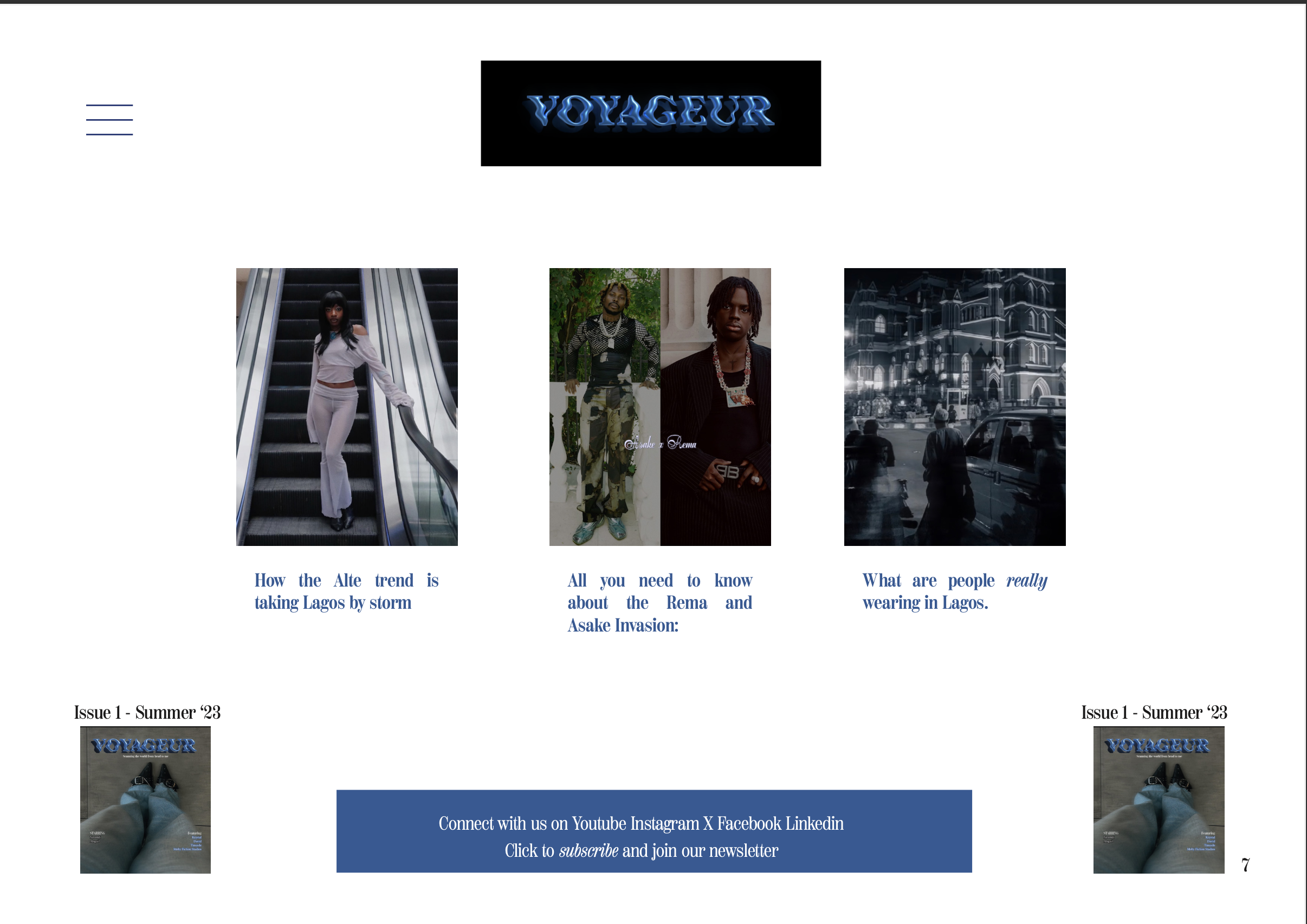
My final MA deliverable at Condé Nast College: build a media platform in a medium of my choice, backed by a dissertation. I chose a bi-annual magazine, Voyageur and website, dissertation titled “How Are Fashion Identities Constructed & Communicated Today.”
To read our first issue click here and have a full view of the website mock up here
Newcastle University Fashion Society


The Brief
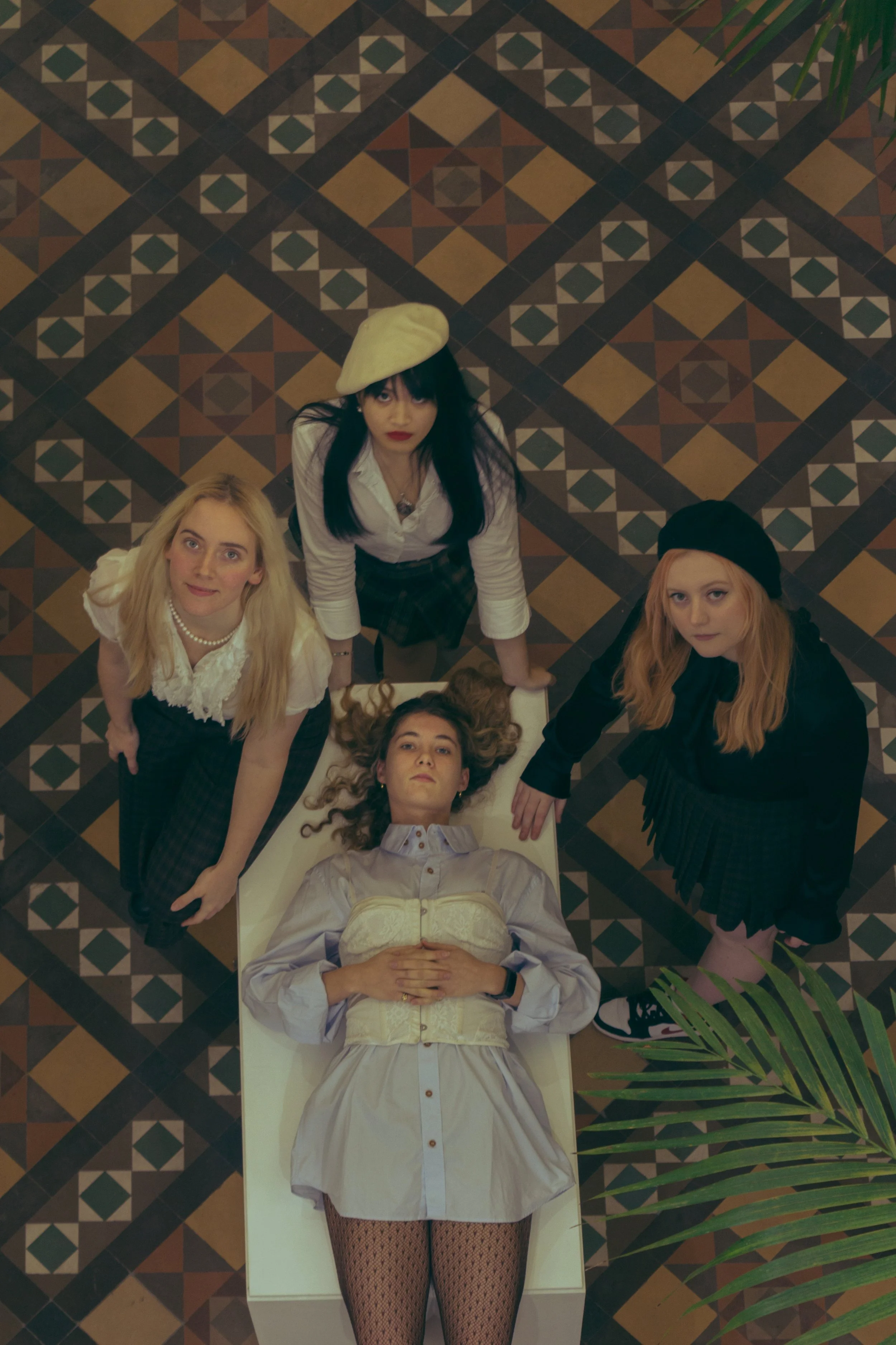
As Editorial Director of NUFS, I set the yearly theme for two consecutive editions: Fashion x Architecture, then Fashion x Music. Both drew on the same conviction - that fashion doesn't exist in isolation, but in constant conversation with the disciplines around it. Architecture produced Virgil Abloh and Pierre Balmain. Music gave us entire genres that became visual uniforms before a note played
The Services
Editorial Direction | Concept Development | Art Direction | Team Leadership
The Insight
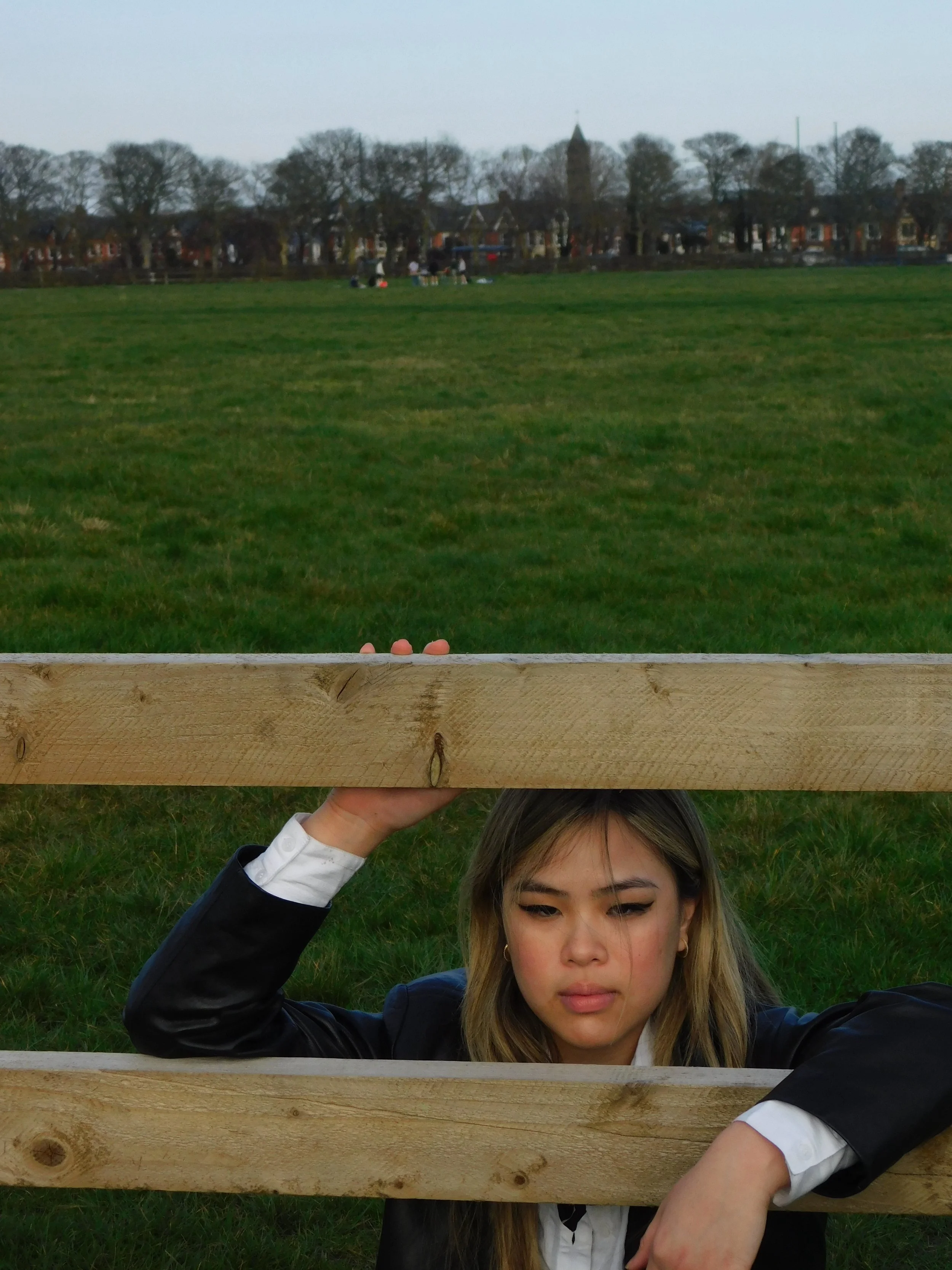
For Architecture: the connection wasn't abstract; it was walking distance away. Setting the editorial on our own campus, using architecture our students walked past daily, made it feel discovered rather than imported.
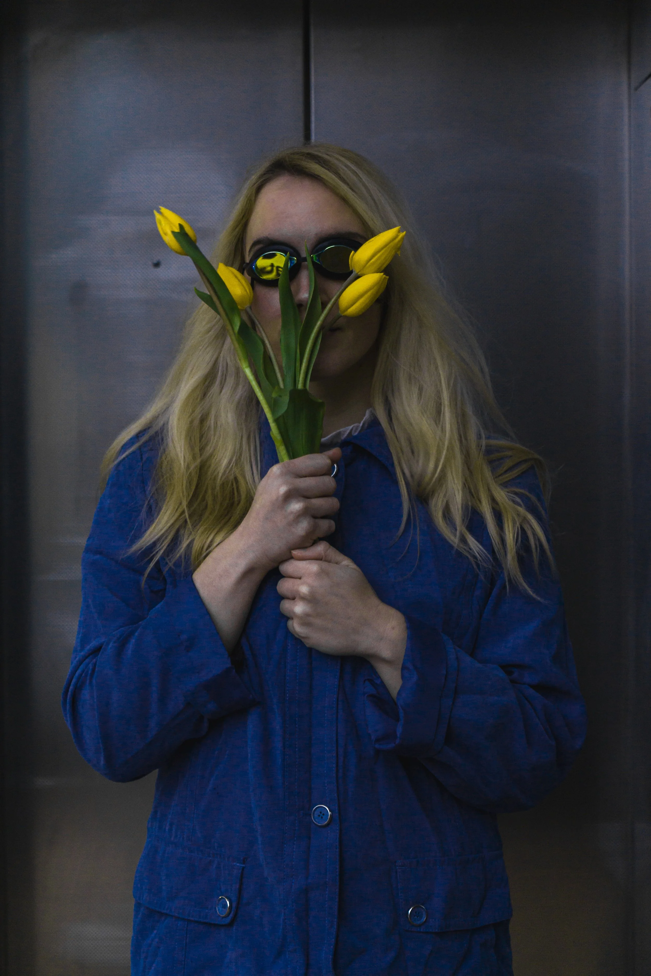
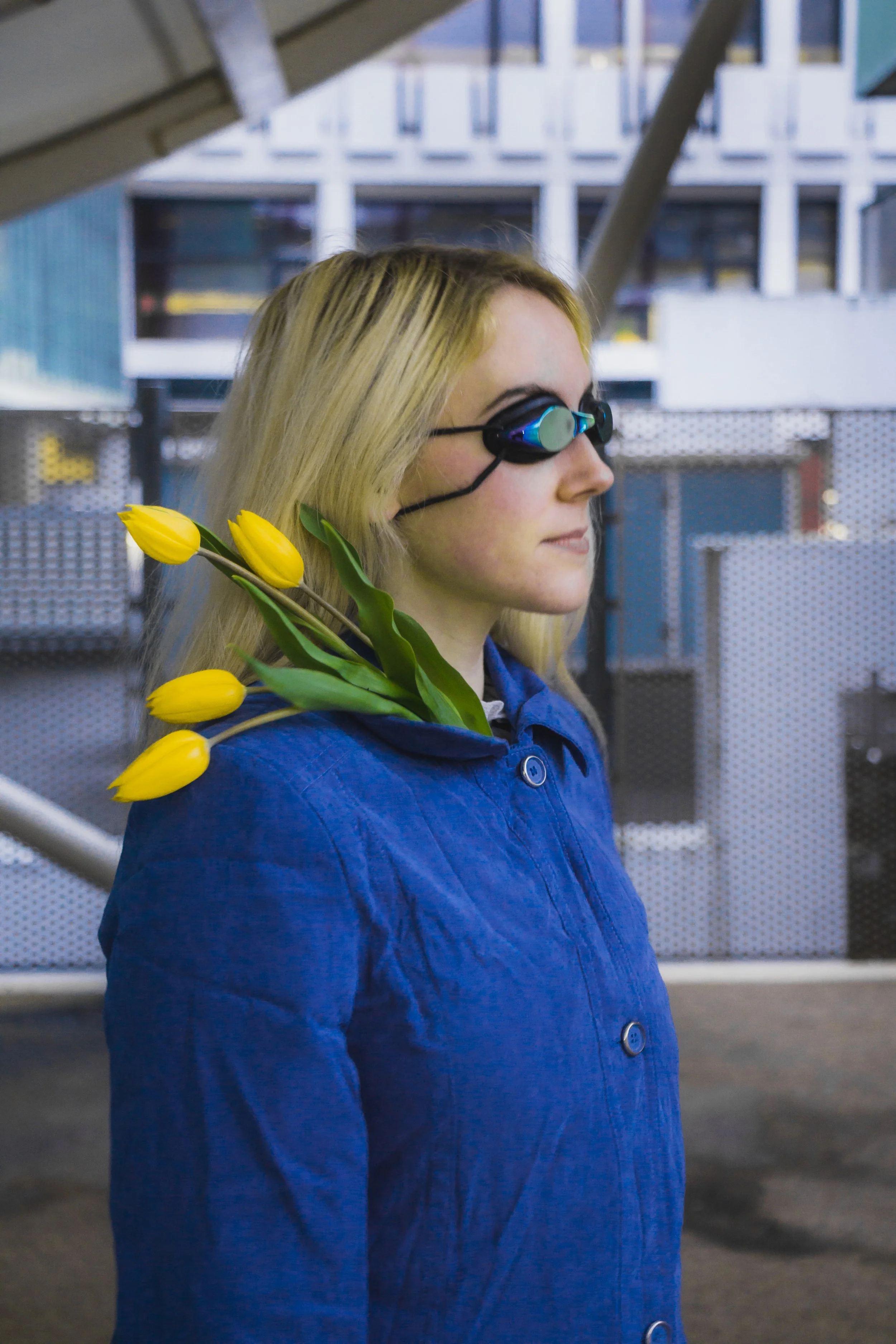
For Music: genre-specific style becomes so codified it functions as shorthand. Leather and a jacket reads as rock before a note plays. Fashion has also long been a tool of protest from Bowie's liberation to BLM's visibility to Styles and BTS pushing androgyny mainstream. The insight was that opposing genres, fused visually, would create tension that said more than either genre could alone.

The Strategy
Fashion x Architecture was shot entirely on campus, pairing fashion against the university's own architecture. Closing with an invitation to see daily surroundings differently.
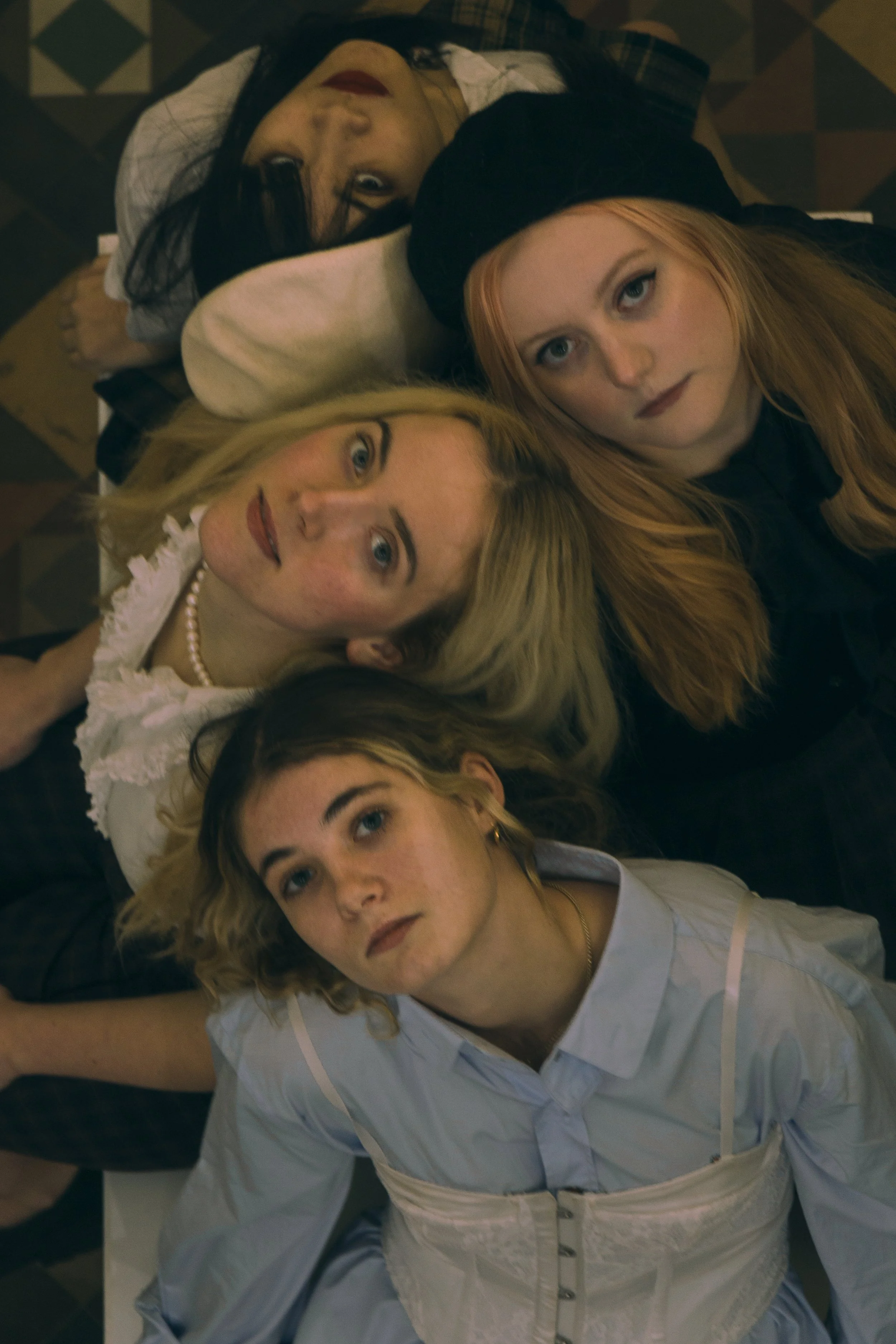
Fashion x Music built the editorial around six genre fusions: Country x Punk, Disco x Jazz, Electronics x Rock, Jazz x Hip-Hop, Y2K x K-pop, Latin x Grunge. Each grounded in real cultural reference points, delivered one shoot a month for six months, like running a monthly magazine.
The Outcome
Across both editions, the work grew the society's popularity and recruitment, built material for future collaborators and our fashion show, and proved that NUFS could sustain a serious, ambitious editorial cadence.
The Music edition in particular demonstrated something harder to fake. The discipline of delivering consistently over six months, not just once.

My Role
Both editions were mine from brief to outcome.
For Architecture, I directed roughly 22 people across photography, styling, editing, modelling and editorial, working with the Architecture Society. My first time managing a full creative team end to end.
For Music, I set concept and direction across all six shoots, worked with writers on the research, and went hands-on where needed, I styled, modelled and did the makeup on Electronics x Rock.
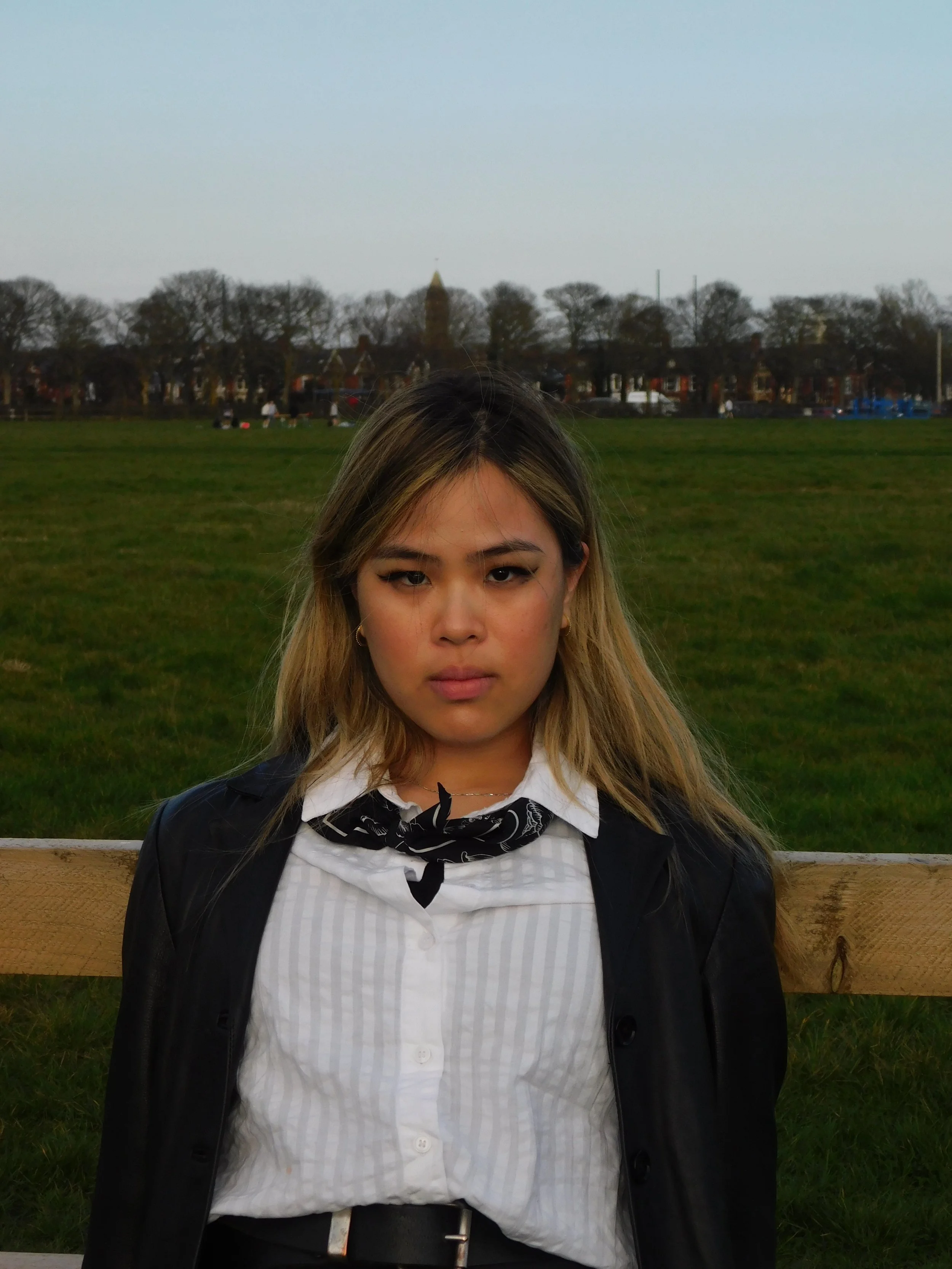
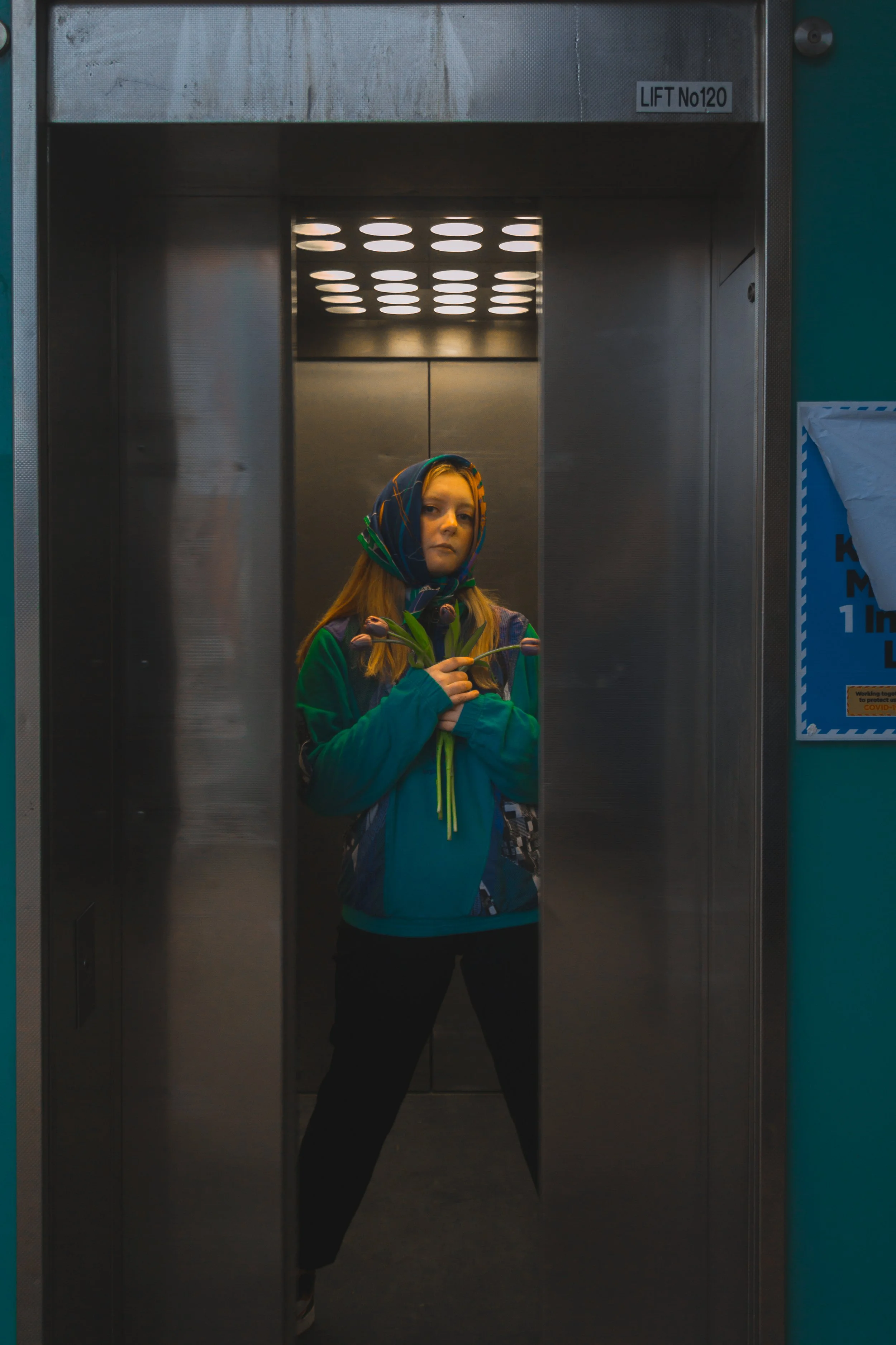
The Brief
A promotional video for the Loom x FoundPop pop-up in Notting Hill during Sustainable Fashion Week. FoundPop supplies short-term furniture and interior styling for pop-ups; Loom is an app matching people with designers who up-cycle old clothing, each rail styled to a different designer’s aesthetic. I was briefed against a real reference library. Event recaps, brand shoots, an interview series with the direction to move away from “cheesy” captions and heavy effects toward something calmer and more premium.
The Services
Concept Development | Art Direction | Production
The Insight
Most pop-up promo content leans on close-ups of the clothing alone. This collaboration was distinct because of the experience around it. Curated furniture, interior styling, a different designer’s aesthetic per rail. So, the real story wasn’t just “up-cycled clothes,” it was sustainability made to feel considered and elevated, not like a compromise.
The Strategy
I built the video around the store experience itself, not just product: the furniture, the layout, the rail-by-rail styling, tied back to the sustainability message throughout. I used a trending hook format and audio to stay platform-native, but paired it with a calm, considered voiceover rather than heavy effects, matching the brief’s specific ask for something more premium.
My Role
I pitched the concept, scouted and filmed on location in Notting Hill, and edited the video solo, including recording my own voiceover. Full ownership from pitch through to final cut.
The Outcome
As an early-stage startup, FoundPop didn’t have formal analytics reporting in place, but the video was well received internally, and a piece of the content was picked up and featured on Loom’s own Instagram, real external validation that the tone and craft landed exactly where the brief asked.
FoundPop
The Human Inteference
4 part short fashion film
The Brief
As NUFS Editorial Director, we had a yearly fashion show and we needed to come up with a theme and promo materials.
I was part of the group that set the concept for a 4-part short fashion film series, Human Interference, exploring humanity’s relationship with nature through the four elements; created as promo for our annual fashion show.
To watch all four parts click here
The Services
Creative Direction | Styling | Production Support
The Insight
Fast fashion’s growth has consistently prioritised economic prosperity over environmental cost. An issue we wanted the society’s biggest annual moment to actually stand for, not just showcase clothes around.
The Strategy
As a group, curated ethical and sustainable pieces from external designers alongside an original collection made using the society’s own sewing talent, then built a four-part film series, one per element, to promote the fashion show.
My Role
One of seven Creative Directors on a large production team. Converted screenplays into visual storyboards, pulled and directed styling looks, contributed to location scouting, was on shoot days to ensure execution matched script, and worked with the videographer on post-production.
The Outcome
The fashion show sold out at over 200 tickets, generated new collaborations and model sign-ups, and secured us a hosting space. The strongest commercial result of my time as Editorial Director.
Celie

The Services
Brand Strategy | Identity Design | Art Direction | Photography | UX Design | Copywriting
The Insight
The first instinct with Celie was to build something around her trauma. I resisted it. Her story starts in a negative light, but what moved me was where it ended. Thirty years on, she becomes her own person. She only gets there through the women around her, who show her what independence actually looks like from the inside. The insight was that her next chapter had nothing to do with surviving hardship and everything to do with what comes after: unconditional loving of self, community and growth. That's where the brand needed to live: in the after, not the during.
The Strategy
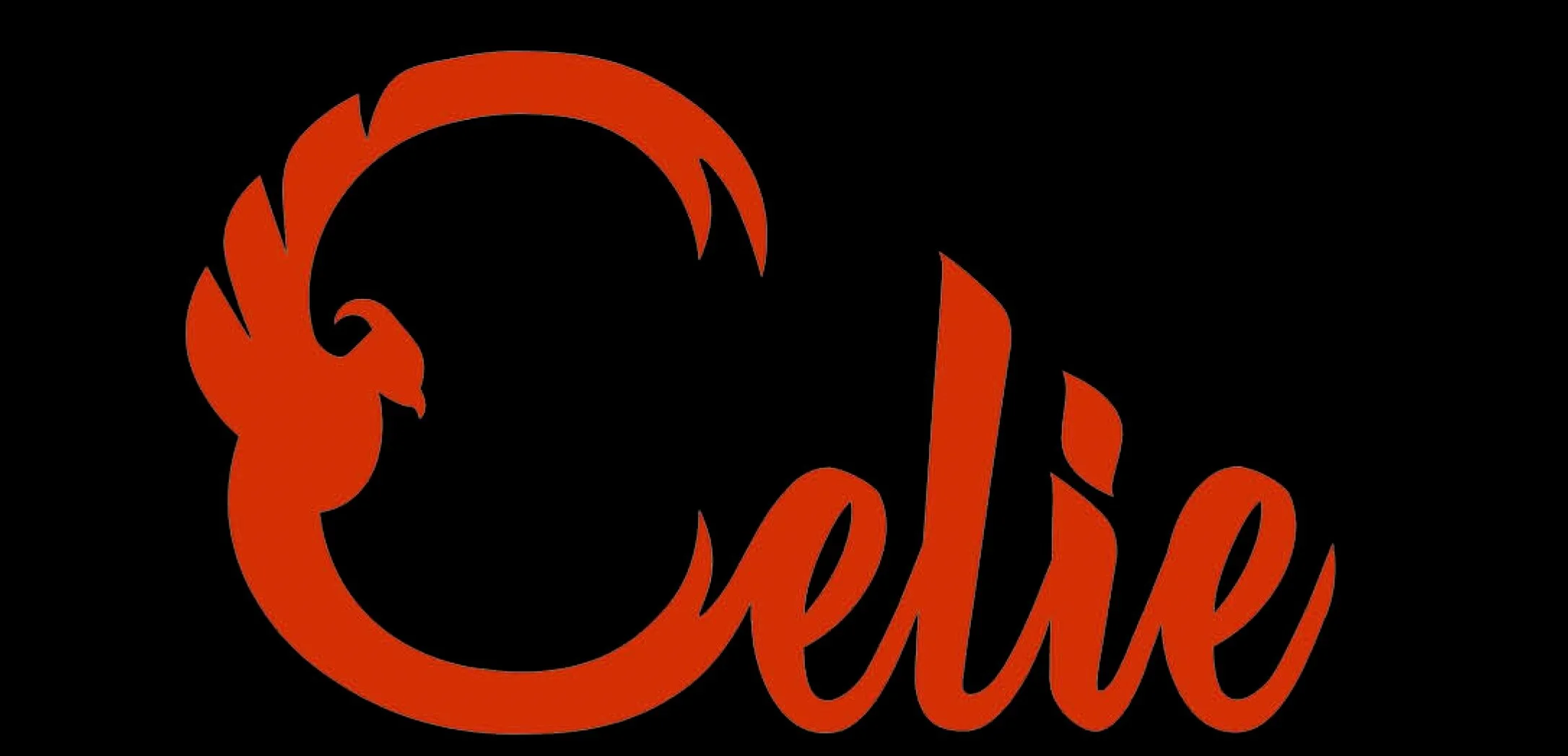
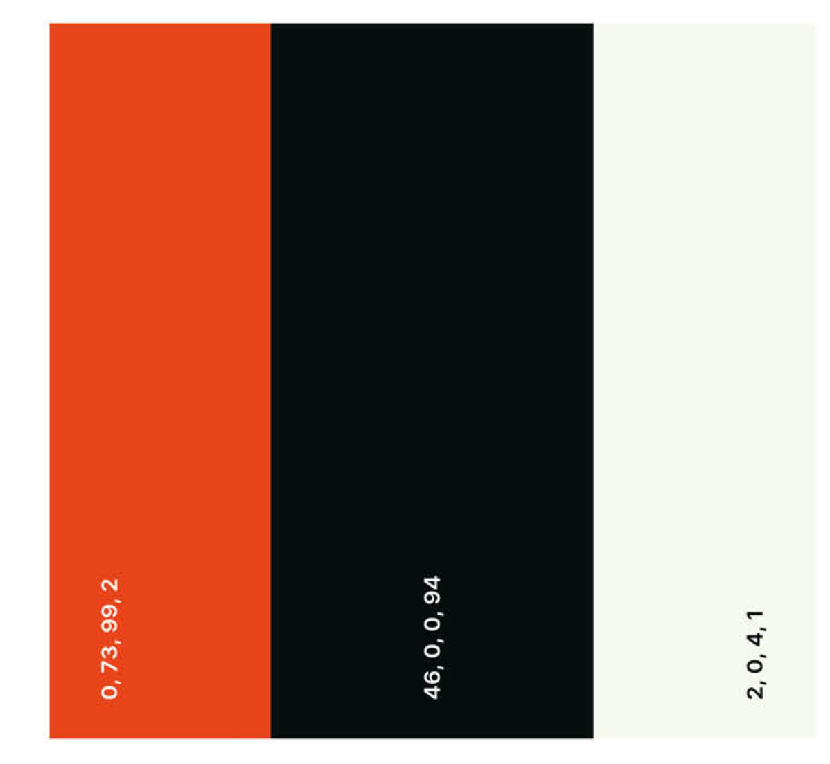
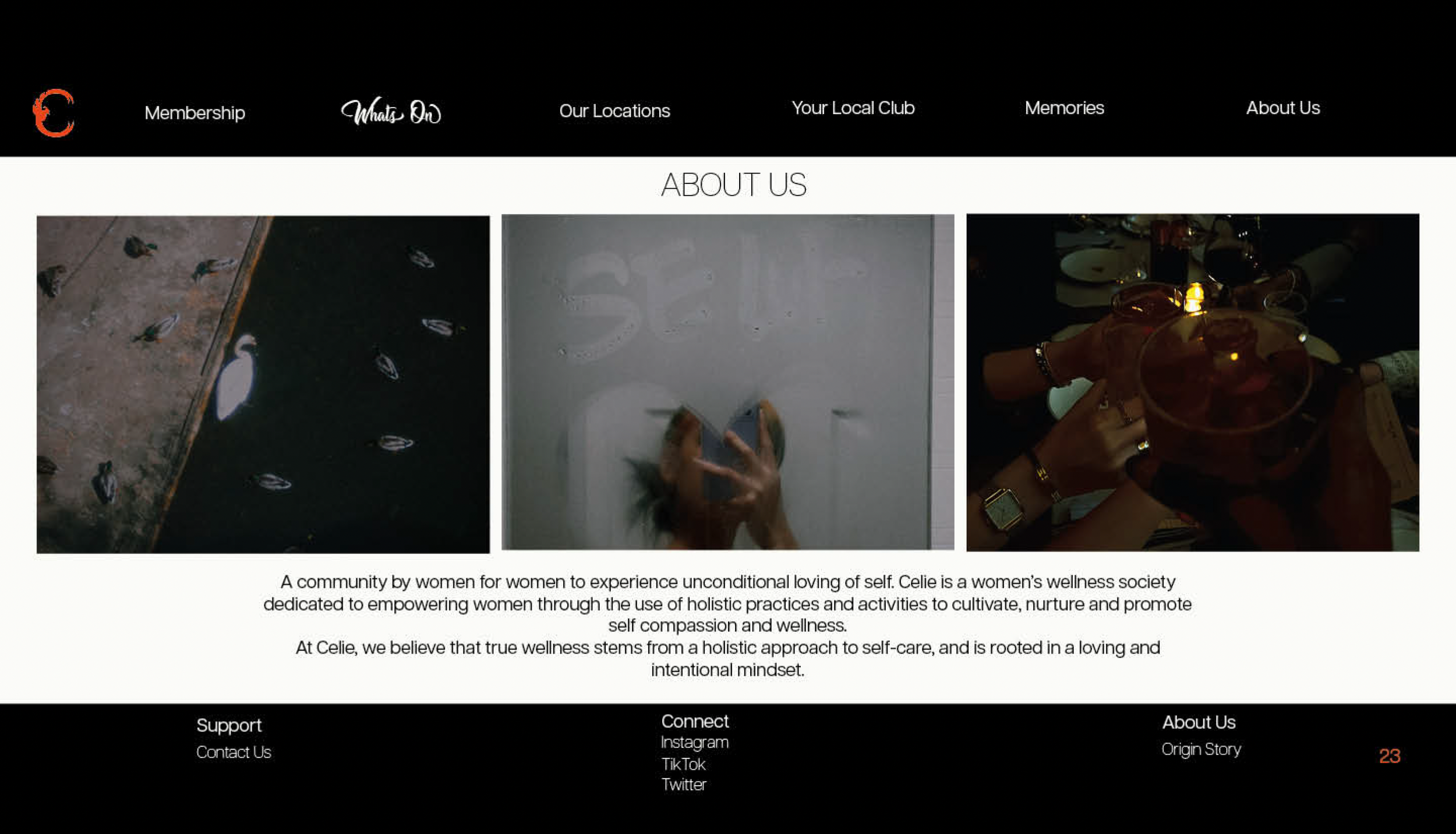
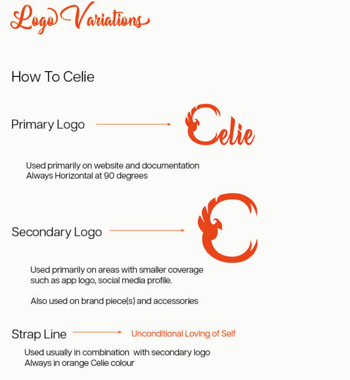
I built Celie as a women's wellness society: a community by women, for women, structured around holistic practices that cultivate self-compassion across mind, body, spirit and finances. The colour palette was built around a single anchor, Celie Orange, drawn from sunrise, symbolising renewal, warmth and a new day. Midnight black and creamy white support it, appearing where legibility is needed while orange is reserved for the logo and moments of emphasis. The Allesia script typeface gave the logo its cursive femininity; Articulate CF grounds the body text with clarity.
The logo is built around a phoenix embedded into the letter C - rebirth made literal, a woman rising from her ashes. The strap line: Unconditional Loving of Self.
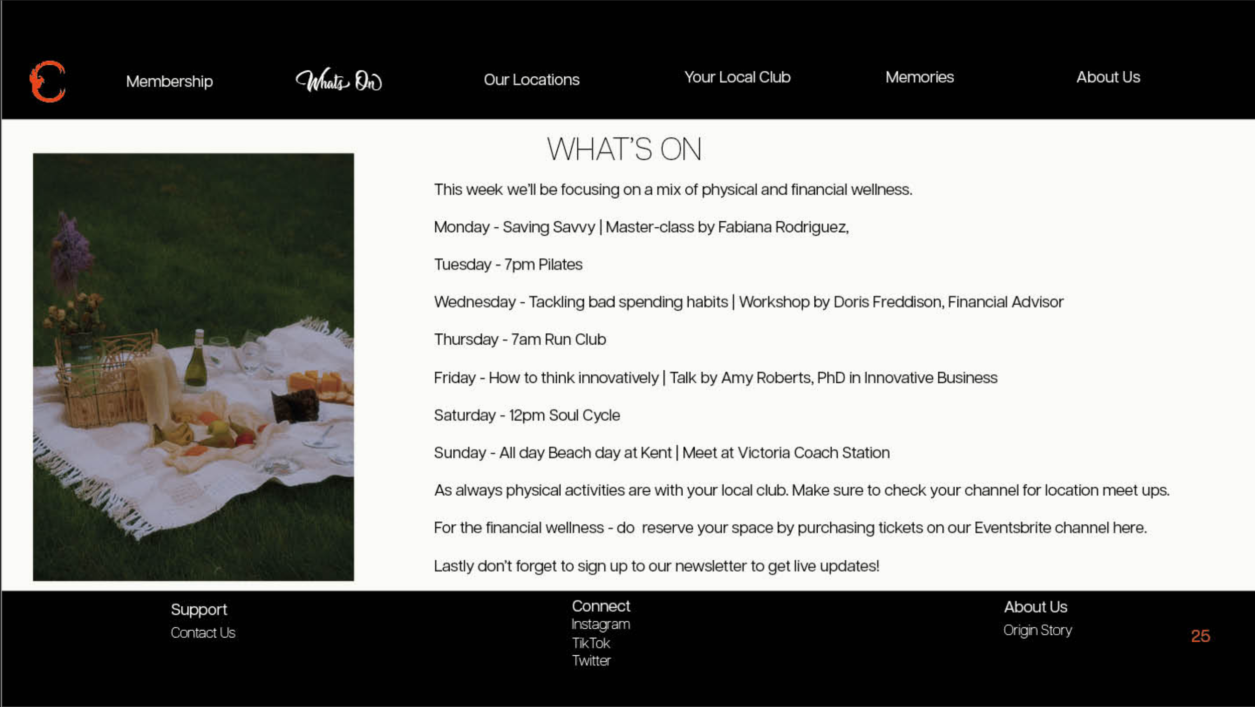
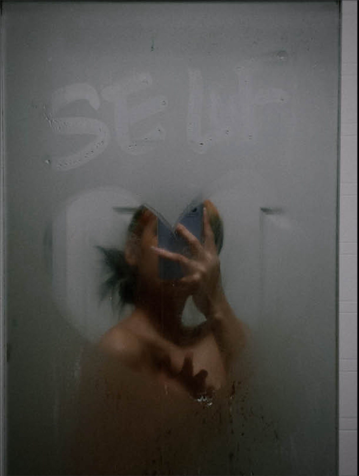
The photography shoot used only still life, no model, deliberately. Objects from a woman's world: roses, a vanity table covered in beauty products, a picnic on the grass, a rose-petal bath, the texture of daily life. The absence of a face was the strategic decision: any woman should be able to see her own story in it. The images were shot on film, giving them a warmth and intimacy that felt right for a brand built on softness.
The website extended the values into a real commercial mechanic: a Celie x Solace partnership, donating 10% of every membership fee to Solace Women's Aid, funding a month-long retreat of masterclasses, workshops and wellness for women in their programme, mental, physical, emotional and financial. It wasn't a gesture. It was structural. Built into the landing page, clearly priced, directly tied to the origin story.
My Role
Solo across everything: brand strategy, full identity system, colour and typography decisions, photography direction and shoot execution, website UX across three pages: landing page, About Us and the Celie x Solace partnership page and the brand piece of print. Every decision, including the ones that felt small, was intentional.
The Outcome
Awarded a Distinction. The project that first taught me how a single creative choice, casting no model at all, can carry more strategic weight than a whole page of copy. It also showed me how purposeful a brand can be when its commercial mechanics and its values are the same thing, not separate conversations.
An Academic Brief
To build a complete brand from a movie character. I chose Celie from The Color Purple. An African-American woman whose story moves from abuse, loss and silence into ownership, independence and self-knowledge. The deliverables were a full brand book (logo, identity system, colour palette, typography, values), a still-life photography shoot, and three website landing pages.

Krystal et Moi
The Brief
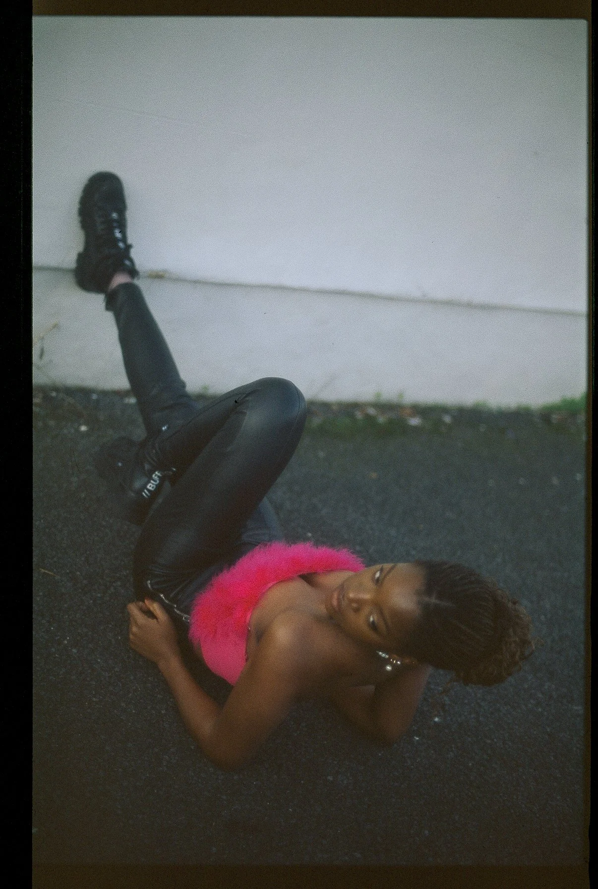
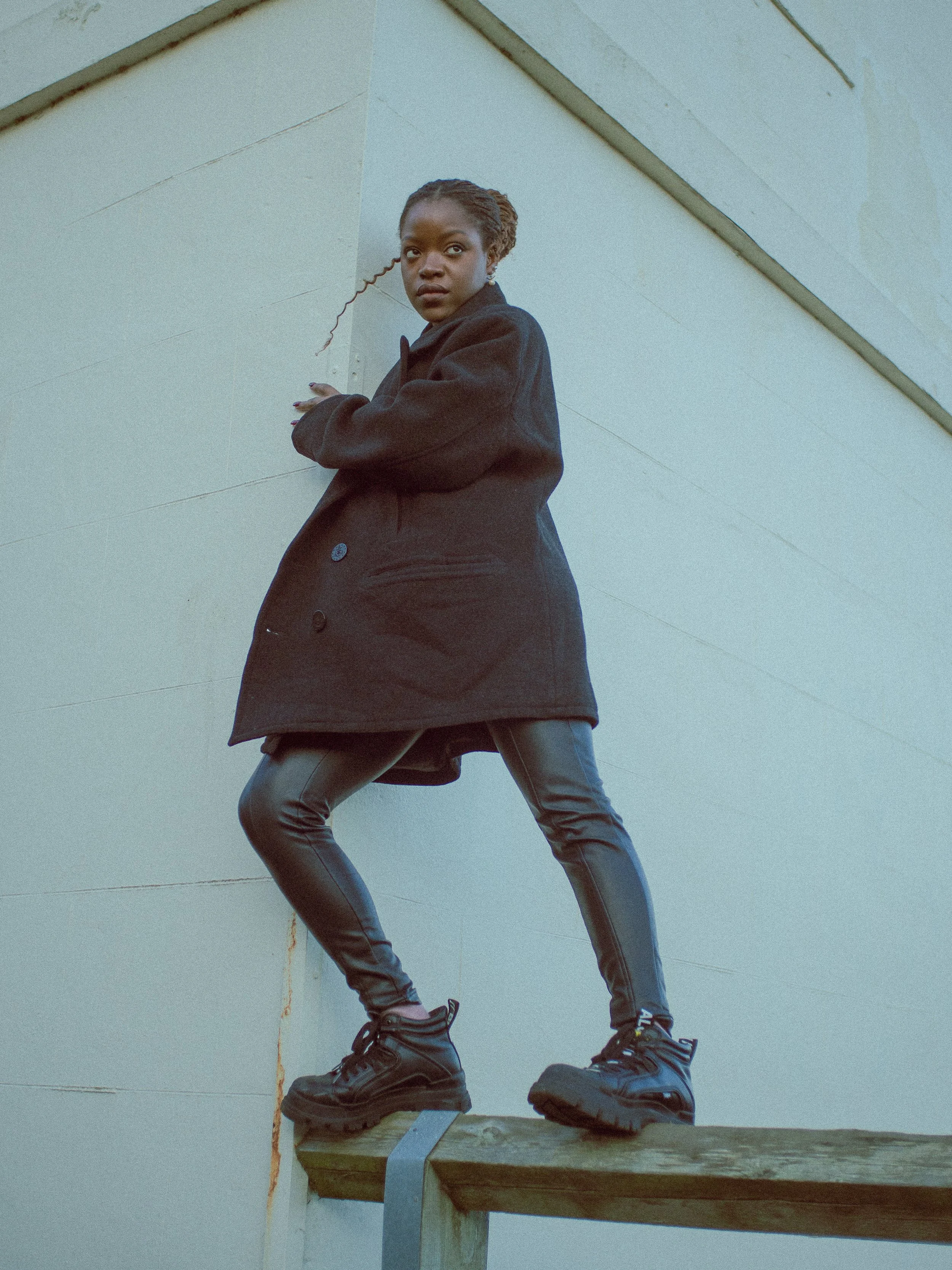
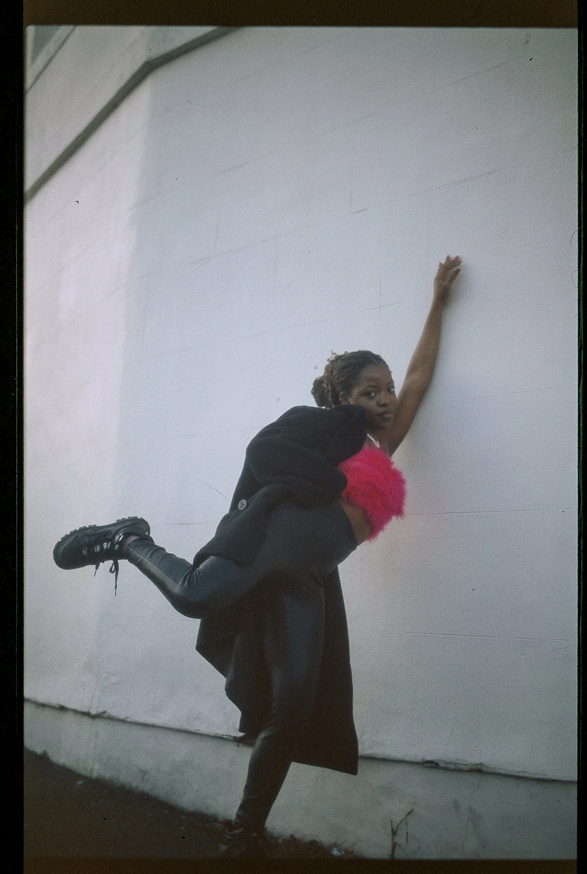
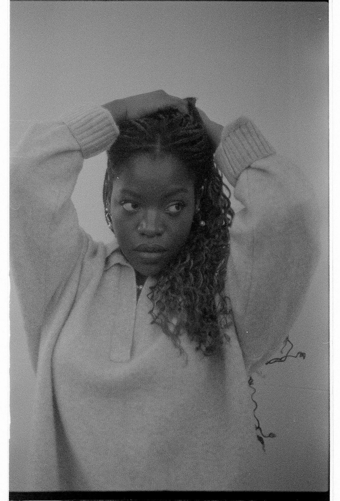
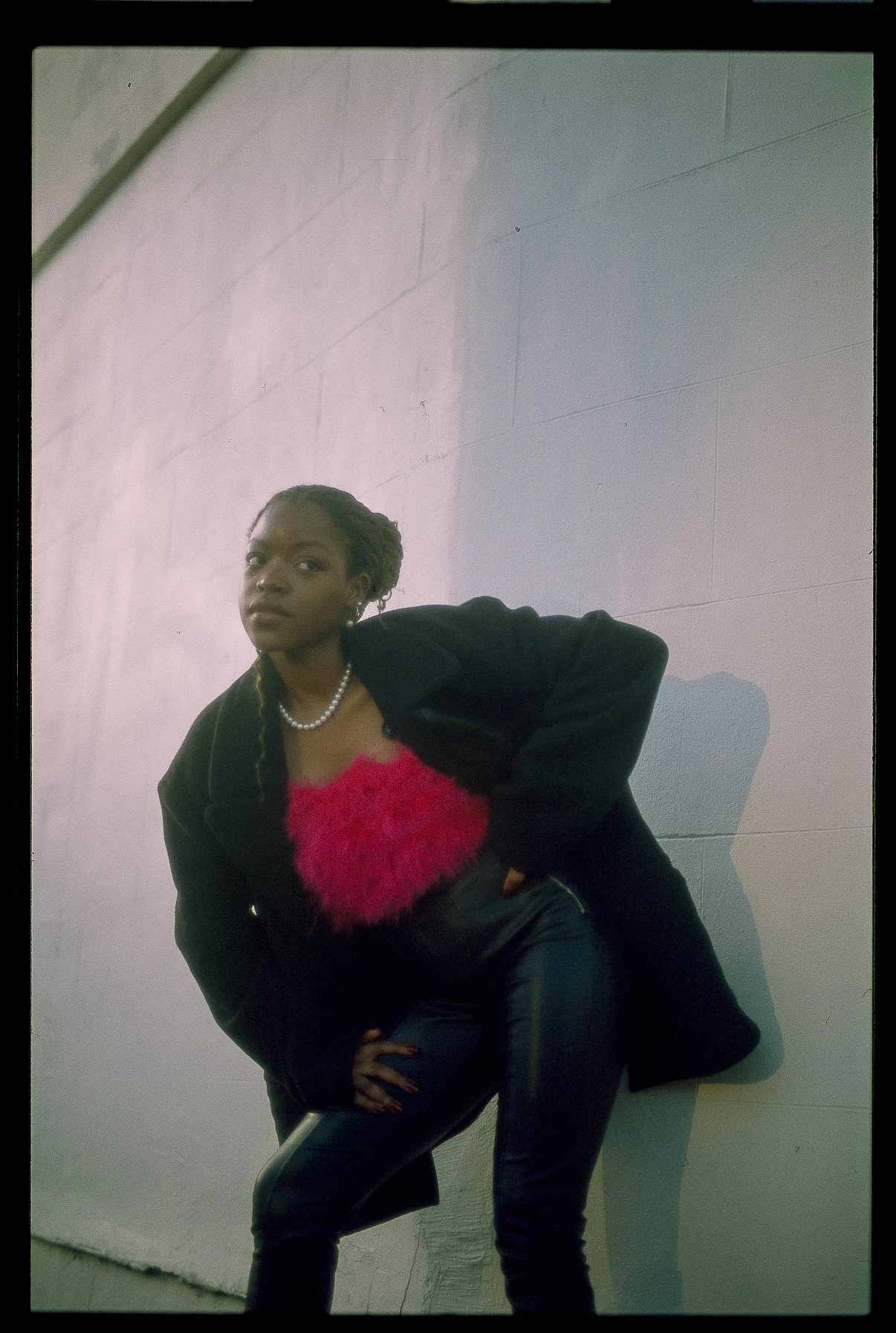
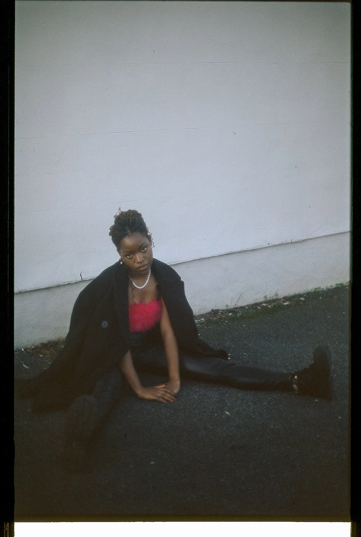
Self-initiated. My portfolio at the time was almost entirely client and academic brand work. I wanted a piece that was unmistakably personal, showing my own creative point of view rather than a brief I was executing for someone else.


The Services
Creative Direction | Photography Commissioning
The Insight
The tone I wanted to build into my personal brand was considered and natural, not overproduced. Krystal, a photographer friend with unfinished film she wanted to shoot, had exactly that calm, nature-driven aesthetic . The right collaborator for the mood I was after, not just a convenient one.


The Outcome
Seeing my own concept fully realised, and collaborating with a friend rather than a stranger, was genuinely rewarding. It was also my first time in front of the camera — and it confirmed clearly that my place is behind the lens directing, not in front of it.

The Strategy
Commissioned Krystal and briefed her toward a more introspective, somber mood layered onto her existing style, deliberately choosing a photographer whose natural eye already matched the direction rather than one I’d need to redirect entirely. When we couldn’t secure a model on short notice, I stepped in front of the camera myself.
My Role
Conceived the personal brief, selected and commissioned the photographer specifically for aesthetic fit, and stepped in as the subject when plans changed.